 Chloe and I are at it again… we can't seem to leave (almost) well enough alone and tweaked our blog design again. Maybe it's just the DIY-ers in us, maybe it's because we were on vacation and didn't have access to all our crafts, but one day, maybe it was a really snowy one, we just decided our website needed modifying. Again. Which got us thinking: what makes a blog design effective? What do we look for when we find a blog that makes us think gosh, our website needs updating yet again? Let's start at the top and work our way down, realizing this is what we like (i.e., tips) not hard and fast rules!
Header: A header should be distinctive and express your personality and tell your reader who you are or what you do. If I had my way, Popcosmo would have one look and stay the same year to year. But that's me. Chloe, as a teen, is evolving and her taste is changing dramatically year to year. And since she is the designer, her opinion rules, so our header has changed frequently, but one element has stayed consistent: we've always had a heart somewhere in our logo. But we haven't been able to find a heart we like with this new logo!
Consistency is queen (behind creativity) even when your logo changes; but, if you're going to make a dramatic change, then more power to you. If you have a "signature," like our heart, then work around it. We tended to make a change when we rebrand, and then we tweaked the logo to and layout to better express us.
Also, popcosmo doesn't mean anything, we made sure that we mention that we "are a blog for moms, teens and everyone in-between" somewhere on our homepage. BOTH of these items (heart and tagline) are still being fiddled with by us, so check back to see how we resolve them :)
Here's our logo design evolution from our teen site to our present day mom/teen site above. The last two were designed by Chloe: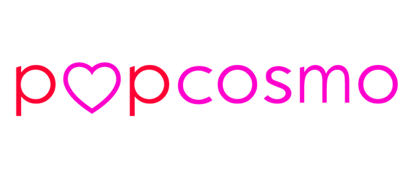


Navigation: Being able to access and navigate around a website should be easy. For instance, if it takes 3 click just to find a story, I'm leaving. Secondarily to reading what is on the landing page, you want your reader to be able to easily navigate through your site. There are typically 3 ways a reader will do this:
- Menu - typically below the header or on the sidebar. Although they look great on the sidebar, Chloe designed ours below the header, which we both like the look of and the ease of for the reader. A simple drop-down menu is simple for the reader and instinctive when they are looking for where to go.
- Search Bar - ours is above the fold on every page and critical since we have so many articles that go back more than a few pages
- Highlighted Posts - We use WP plug-ins and saw a dramatic rise when we installed them. We also added some sections on the sidebar (those big black circles to your right) that weren't on the main menu (but are on the drop-down menu, i.e., Blog Tips). We also have our most popular posts highlighted on the sidebar. It seems a bit like overkill when I write this out, but each person reading a different story will see a different "popular" post or highlighted post and hopefully inspire them to linger longer.
Call to Action: Do you want your reader to sign up for emails or comment? Do you want them to pin a picture, G+, or follow you on Instagram? Then you have to ask very nicely, or hint very loudly, so we make sure our share buttons are prominent at the end of each story. I have to admit, we don't ask our readers to share enough (hey y'all, we love when you share, and we really love it when you follow us on Instagram or Twitter and especially when you leave a comment or share a DIY with us!) but the point is make sure you are asking your readers to do something when they visit you or they'll just pop by and leave.
Font and background:
Don't underestimate the power of design and font! Chloe and I kid about it, but we'll absolutely pick a restaurant because of a cool font (hello Kitchen in Denver). Won't you leave a website that has a sloppy font and is impossible to read?
We do argue about centered fonts - I can't stand them, she loves them. So, this section is for her. Generally, script fonts are pretty but hard to read. 3-4 fonts should be plenty. Since we are both font crazy, agreeing on fonts caused considerable arguments, but I think we've finally found a middle ground!
Sidebar: KISS. Yep, Keep It Simple, Stupid. We have so much information we'd love to put in our sidebar, but we just resist the urge. We don't run ads, so that's one thing that keeps it clean, but ads are $$$, so we are considering them. Just make sure they are kept to the same size or within the same block so it doesn't look cluttered. Another idea is to move your ads to the bottom of your sidebar or to the footer.
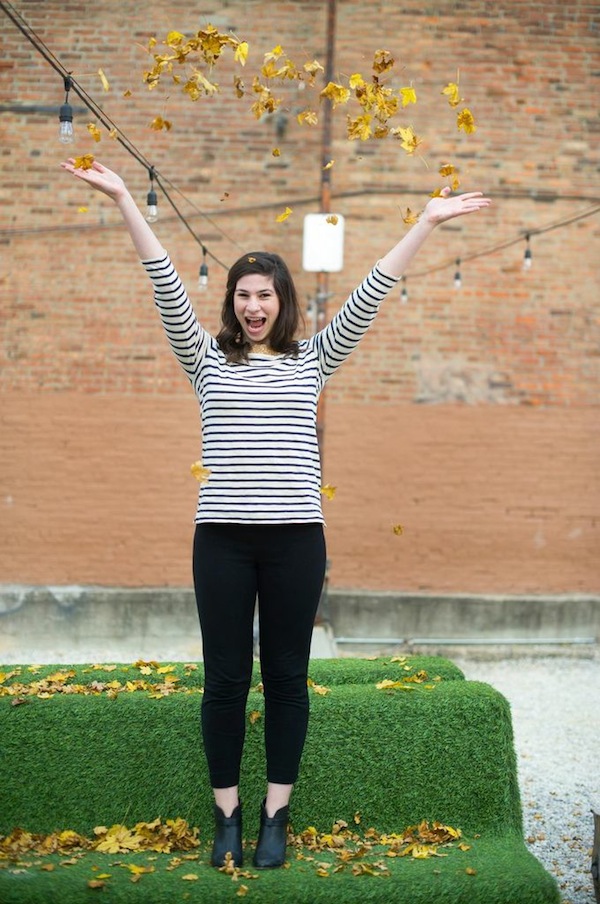
Photos: The bigger the better. Yep, really. Well, sort of. Make them as wide as possible. Know your margins and make the width of your photos the same as your content. It's all about visual appeal and a photo that aligns with your copy is visually appealing. Of course, it can't always be the same width, so center them if they can't be as wide as your copy. If they are larger than your margins, then resize before importing to help with your website speed.
Here's why… you see the same photo above and below, but which looks better?

Color: In this case, less is more. Generally, 3-4 colors make a pleasing web design palette and are visually appealing. But we've seen designs with more and less that also work. This is simply a style question of what best represents you, and is not jarring for your readers. Consider how much color will be in your photos / posts and make sure you won't overwhelm your reader, or conversely, that there will be enough color to interest your reader. But, don't forget about whitespace… it can be the difference between a good homepage and a great homepage. Whitespace separates blocks of information and can create balance on a page, which will give it uniformity without clutter.
Contact: Can your readers and brands reach you? Is your contact info on your homepage or readily apparent? Ours is on our advertising page, our press page, and who we are page. We want people to read about us to make sure it's a good fit, BUT we are considering adding an email icon to the homepage.
Consistency: Check the overall design for mood, consistency and balance. Consistency in design allows the eye to flow from one area to the next without distraction and enhances the reader's experience, which in the end, will make them want to come back. And isn't that what we all want?
Are there any web design tips you want to share? Or any web design quirks that drive you crazy? Or any web design advice you want to share with us?
xox ~Kim


